Color is one of the most powerful elements in interior design. The right color palette can make a room feel warm, spacious, calming, or energetic. However, choosing the perfect colors for your home can be overwhelming with so many options available. This guide will help you understand how to select the best colors for every room, ensuring a cohesive and stylish look.
1. Understand the Psychology of Colors
Colors influence emotions and mood, so it’s important to choose shades that match the function of each room. Here’s a quick breakdown of how different colors affect a space:
- Warm colors (red, orange, yellow) – Energetic, inviting, and stimulating. Great for social areas like the living room and dining room.
- Cool colors (blue, green, purple) – Calming, relaxing, and soothing. Ideal for bedrooms and bathrooms.
- Neutral colors (white, gray, beige, taupe) – Versatile, timeless, and sophisticated. They work well in any space and serve as a great base for other colors.
- Dark colors (deep blue, charcoal, emerald, burgundy) – Cozy, dramatic, and elegant. Best for accent walls or well-lit spaces to avoid making a room feel too small.
2. Consider the Room’s Function
Each room has a different purpose, and your color choices should enhance its function.
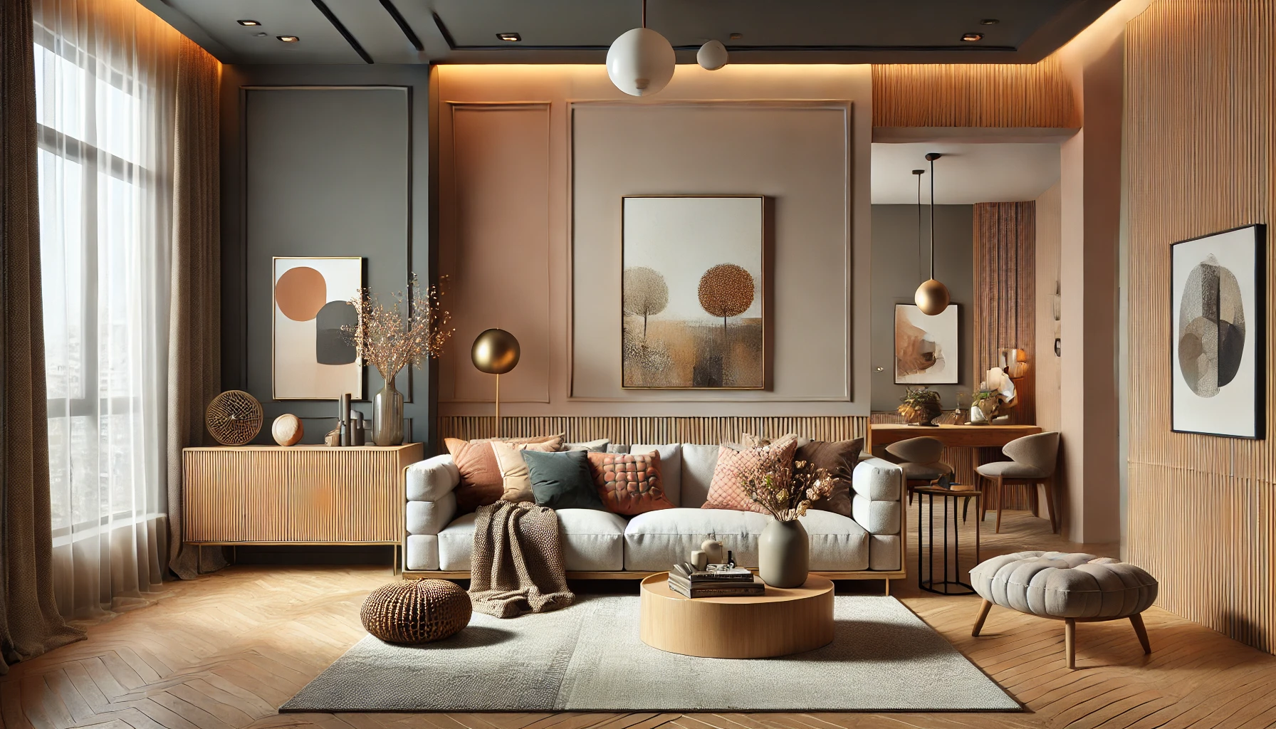
- Living Room: Choose warm and inviting tones like beige, soft gray, or muted blues. These colors encourage relaxation and conversation.
- Bedroom: Opt for soothing hues like soft blue, lavender, or warm neutrals. Avoid overly bright colors, as they can disrupt sleep.
- Kitchen: Light and fresh colors like white, pale yellow, or mint green create a clean and airy feel. Bold colors like red can stimulate appetite but should be used in moderation.
- Bathroom: Cool tones like soft green, sky blue, or crisp white make bathrooms feel refreshing and spa-like.
- Home Office: Neutral and calming colors like light gray, sage green, or soft blue enhance focus and productivity.
- Dining Room: Deep, rich colors like navy, burgundy, or forest green create a cozy and elegant atmosphere.
3. Test Colors in Different Lighting
Lighting plays a huge role in how a color appears in a room. Natural daylight, warm artificial light, and cool artificial light can all change the way a color looks.
- North-facing rooms get less natural light and tend to make colors look cooler. Choose warm shades to balance this effect.
- South-facing rooms receive plenty of light, making most colors look brighter and more natural.
- East-facing rooms get warm morning light but cooler tones in the afternoon. A mix of warm and neutral colors works best.
- West-facing rooms have warmer light in the evening, making colors appear richer in the afternoon.
Before painting a room, test color samples on the walls and observe them throughout the day to see how they change under different lighting conditions.
4. Use the 60-30-10 Rule for Balance
A well-balanced color scheme follows the 60-30-10 rule, which helps create a visually appealing and cohesive space.
- 60% (Main Color): This is the dominant color, typically used on walls or large furniture pieces.
- 30% (Secondary Color): This is a complementary color used for upholstery, curtains, or accent walls.
- 10% (Accent Color): This is the pop of color that adds personality, often found in throw pillows, artwork, or decorative accessories.
For example, in a modern living room, you might use light gray (60%), navy blue (30%), and gold accents (10%) for a sophisticated look.
5. Create a Flow Between Rooms
To make your home feel harmonious, consider how colors transition from one room to another. Using a consistent color palette throughout the home helps create a natural flow.
Tips for maintaining consistency:
- Stick to 3–5 main colors that appear in different rooms in varying amounts.
- Use neutral shades as a base and add color through accents like rugs, cushions, and artwork.
- If you love bold colors, use them as accent walls rather than painting entire rooms in dark or bright shades.
6. Consider Undertones to Avoid Clashing Colors
Even neutral colors have undertones that can affect how they look in a room. For example:
- Warm neutrals (beige, taupe, cream) have yellow, orange, or red undertones, making them feel cozier.
- Cool neutrals (gray, blue, white) have blue, green, or purple undertones, giving a crisp and fresh feel.
If you’re choosing multiple colors, make sure their undertones complement each other to avoid clashing. A warm beige might not pair well with a cool-toned gray, but a warm gray would be a better match.
7. Don’t Be Afraid to Experiment
If you’re unsure about committing to a bold color, start small. Try these ideas:
- Paint a single accent wall to see how a color feels before committing to an entire room.
- Use removable wallpaper for a temporary splash of color.
- Add colorful accessories like throw pillows, rugs, or artwork to introduce color without painting.
This approach allows you to experiment without a big commitment.
Final Thoughts: Make Color Work for You
Choosing the perfect colors for every room involves understanding mood, function, lighting, and balance. By selecting shades that match your style and testing them in different conditions, you can create a cohesive and inviting home.
Start with neutrals, add pops of color strategically, and most importantly—choose colors that make you feel happy and comfortable in your space!